
Every inch of this gorgeously appointed Manhattan Beach home serves a purpose
Welcome to functional splendor.
- CategoryHomes
- Written byEliza Krpoyan
- Photographed byLauren Pressey & Ryan Garvin
As the saying goes, timing is everything. Linda Lavezzo Shea and her husband, Adam Shea, originally looked at their home in 2005 when it was a spec house. They loved the property, the amount of light it got and the corner lot, but the timing wasn’t right. Twelve years later when they wanted more space, the five-bedroom house was on the market.
Nervous whether 3,400 square feet was too much house, they enlisted Wendy Word Design (WWD) to create functional but beautiful spaces. “Wendy came in and really listened to what we had to say about how we wanted to live in the space and how we wanted to live as a family,” shares Linda. “[She] created an intimacy out of all the spaces. The house feels like the perfectly right size for us. It doesn’t feel too big. It doesn’t feel like we’re a family of three in a house that has five bedrooms. We really use every space.”
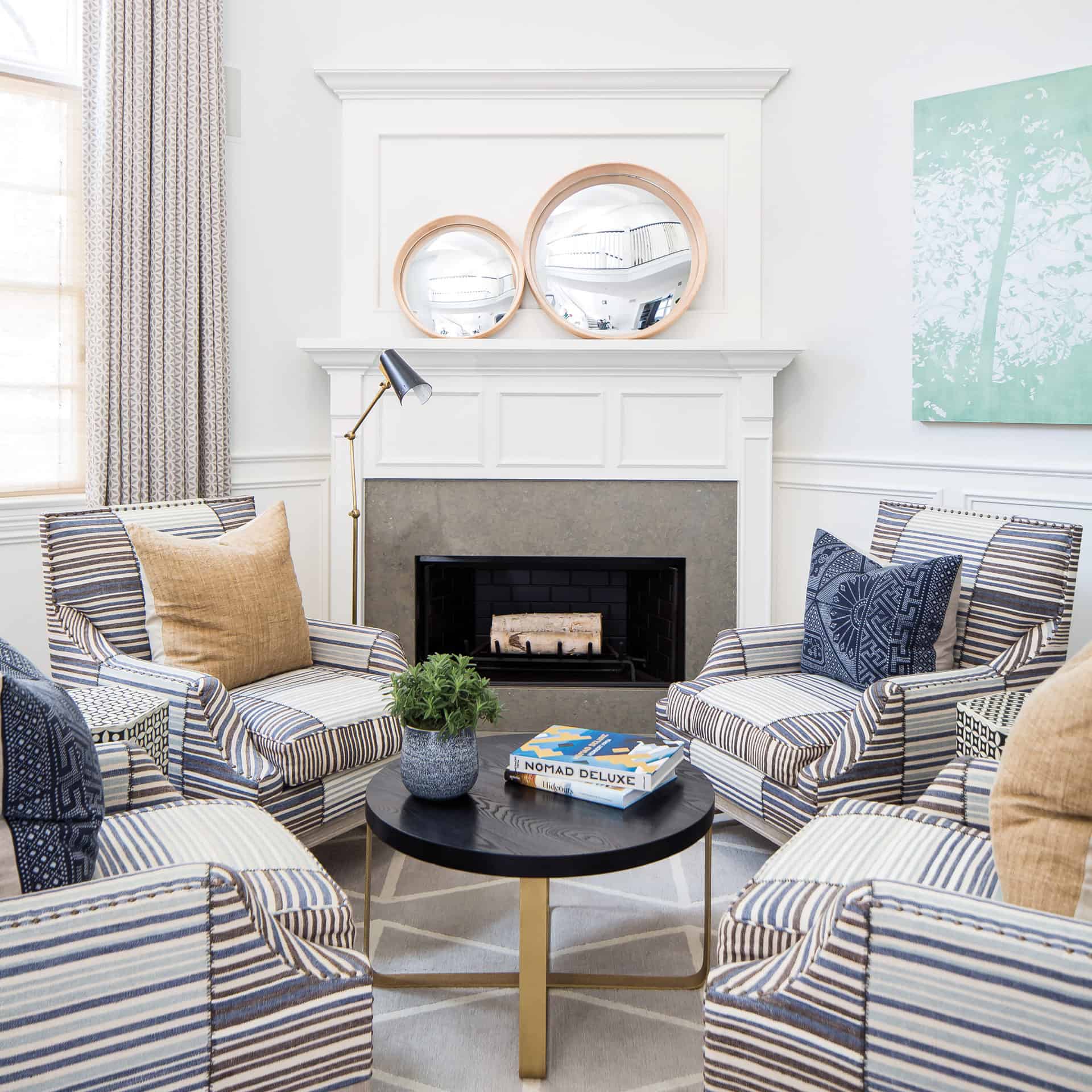
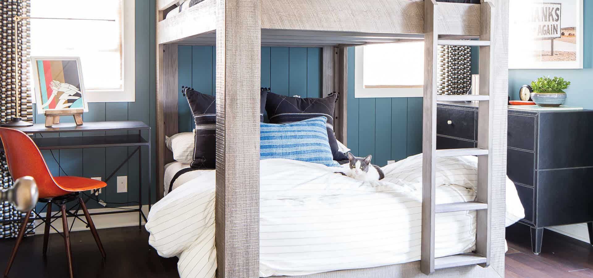
Wendy dialed into the family’s routines and rituals and set out to maximize the home for their lifestyle. For instance, she converted the formal dining room into a teen lounge and media room with new millwork, lighting and cabinetry for the couple’s son, Jackson.
“It really made sense to get rid of the dining room and use it as a space that we would use all the time instead of when we’re only going to use it as a dining room,” explains Linda. The family watches movies here, and Jackson does homework and plays video games. “It gets used literally every day,” she emphasizes. Wendy also added barn doors for everyone’s privacy.
Also on the main floor is an office for Adam. “We considered making that a guest room, but again we have guests maybe once every couple of months. So instead of dedicating a room to a guest room that just sat there and looked pretty, we made it into a space that he uses every day,” says Linda.
Adjacent to the office is the garage and a powder room that they considered removing to make a mudroom. But since it’s nice to have an extra bathroom when entertaining, they decided to keep it. Instead they carved a smaller space to tuck backpacks, cleats, baseball bats and sports bags.
“We didn’t want to make changes for the sake of making changes. We were only going to do something if it made sense,” says Linda of the mindful redesign.
Throughout the house Linda wanted reclaimed white oak hardwood, but she didn’t feel right removing the floors as they were in great condition. “The owners before us had added hardwood upstairs, because it wasn’t originally in the house, and so it just felt wasteful to rip out these floors that were really gorgeous.”
“It wasn’t a matter of money not spent. It was a matter of money well spent,” explains Wendy. She enlisted Scott Smith of Floorz to bring the high-gloss dark walnut up to date. The multi-step processes included removing sheen, sanding it down and color editing.
“I love the floors,” says Linda, “now that I’m in the house. I can’t imagine the light floors being in here. It wouldn’t fit the house at all.”
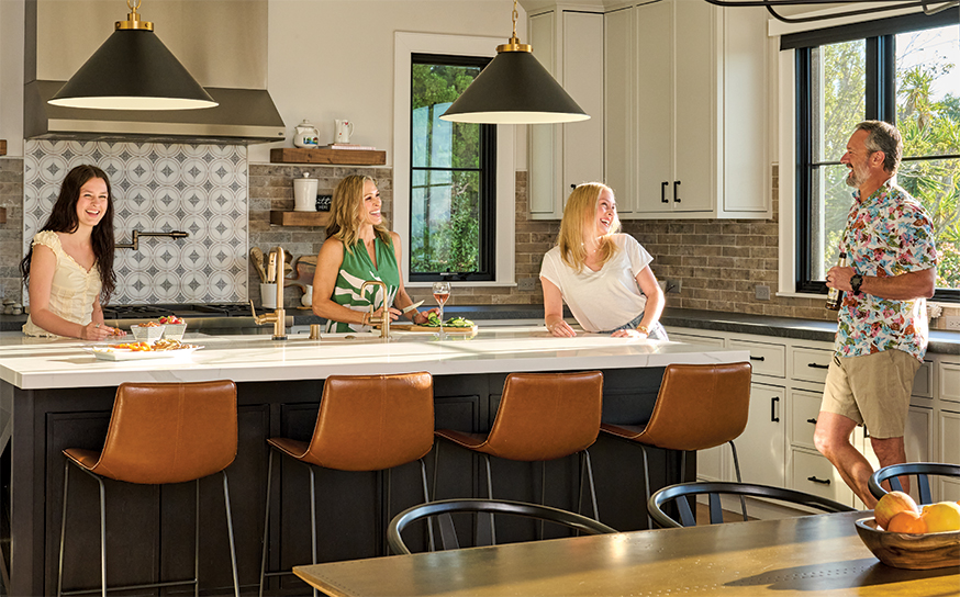
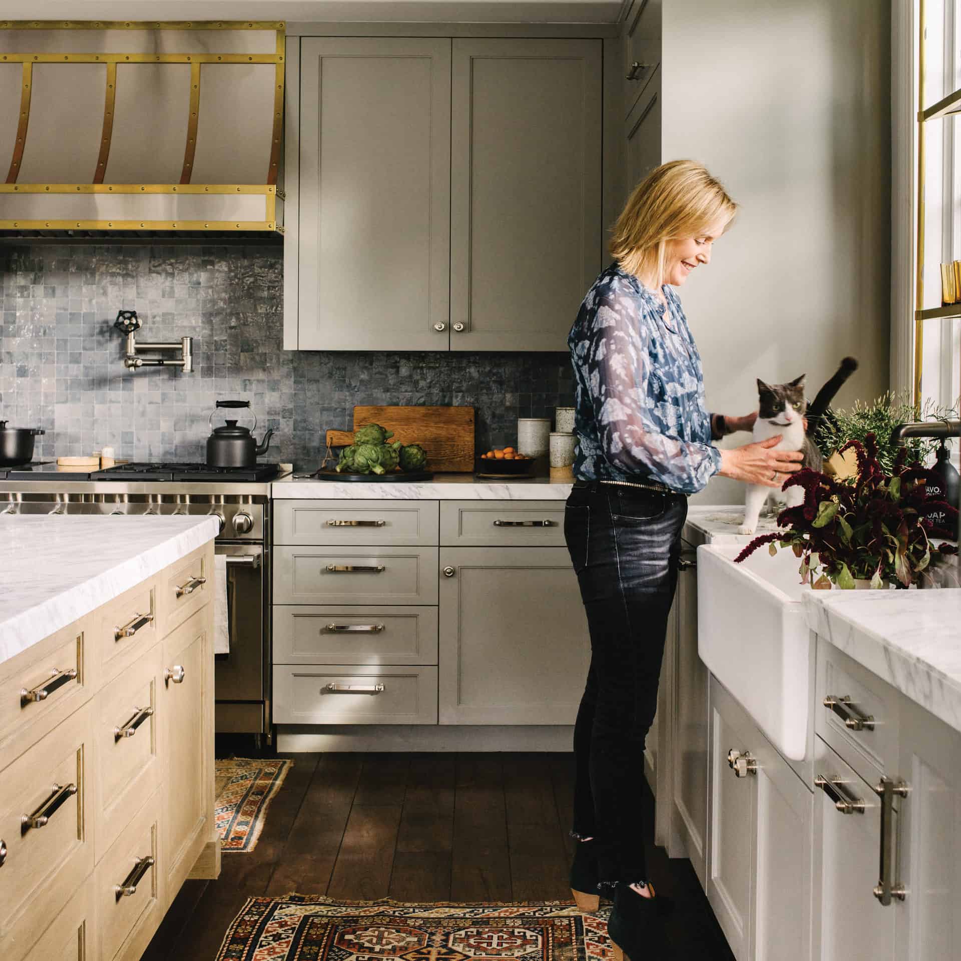
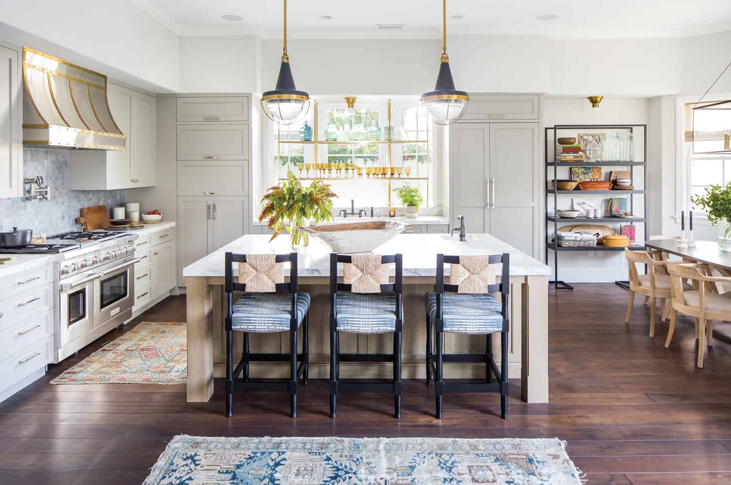
Wendy worked with the existing floorplan. “Walls didn’t need moving, so we didn’t,” she says of the house that was due for an update. The kitchen was fully gutted and redesigned for better form and function. “Changing the kitchen was transformative to the whole house.”
After their first visit, Megan Acuna, a designer on Wendy’s team, was already sketching the kitchen layout in the car. “I remember how excited she was about everything that needed to change and move,” Wendy says, laughing.
The kitchen felt heavy and dark because of floor-to-ceiling cabinets and a layout that obstructed light. Wendy and Megan got rid of the darkness, opened it up and created a dining nook.
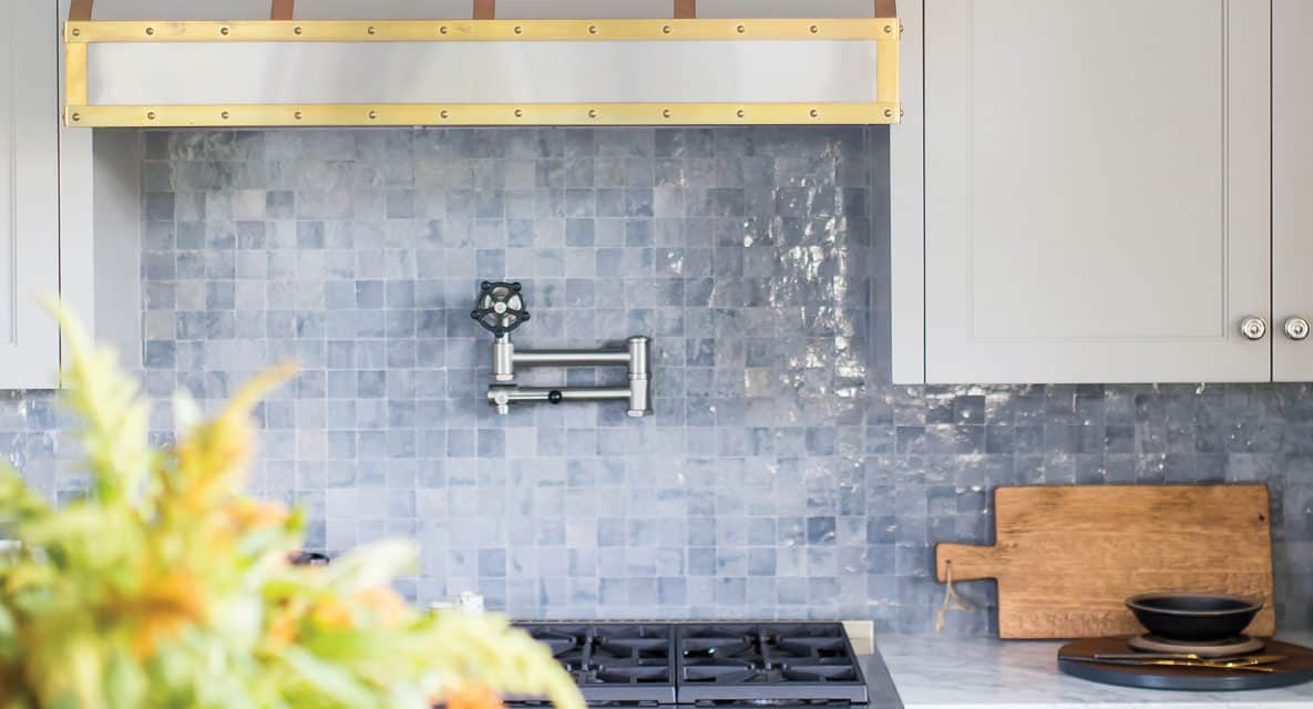
They mixed metal finishes including carbon, un-lacquered brass and polished nickel and opted for a stained white oak for the island and a cool natural satin paint finish for the cabinets. The taupe and grey veins in the Calacatta Vision Extra pulled in the color palette.
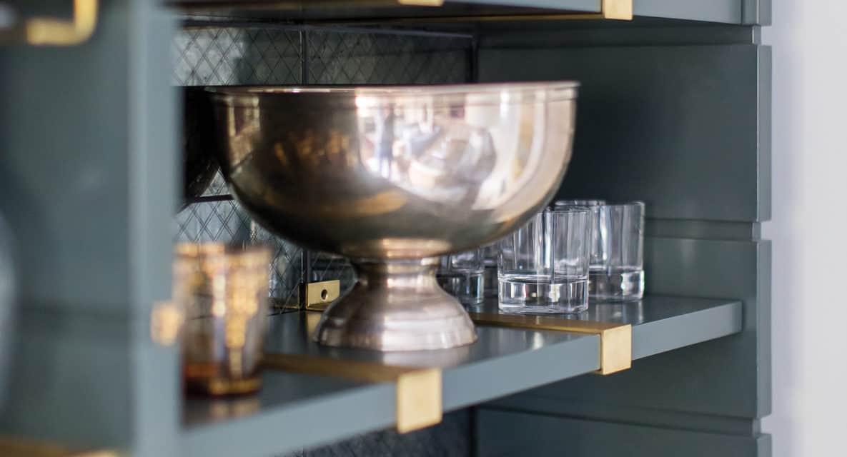
The crowning jewel is the bay window in front of the sink with custom-built brass shelves. “With the beautiful light coming through, colorful glassware made the most sense,” says Megan. Not only does sun shine through, but their landscaper Rob Jones trained bougainvillea to grow over the fence.
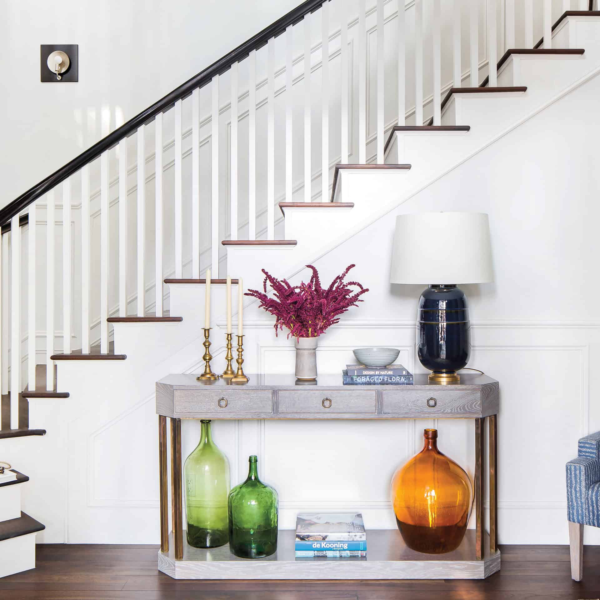
The way light comes in is one of Linda’s favorite features of the home since 2005 when they first saw it. Through the tall window at the entry you see mature olive trees and eucalyptus trees. Wendy mirrored what’s happening outside with a pastel green painting in the seating area that welcomes you into the home.
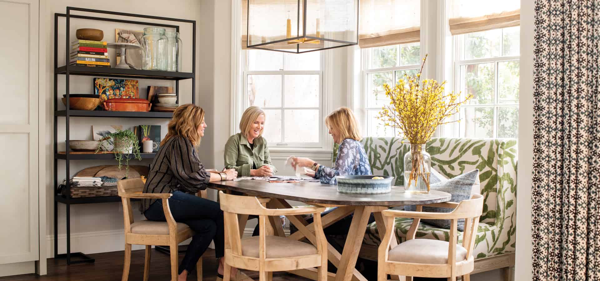
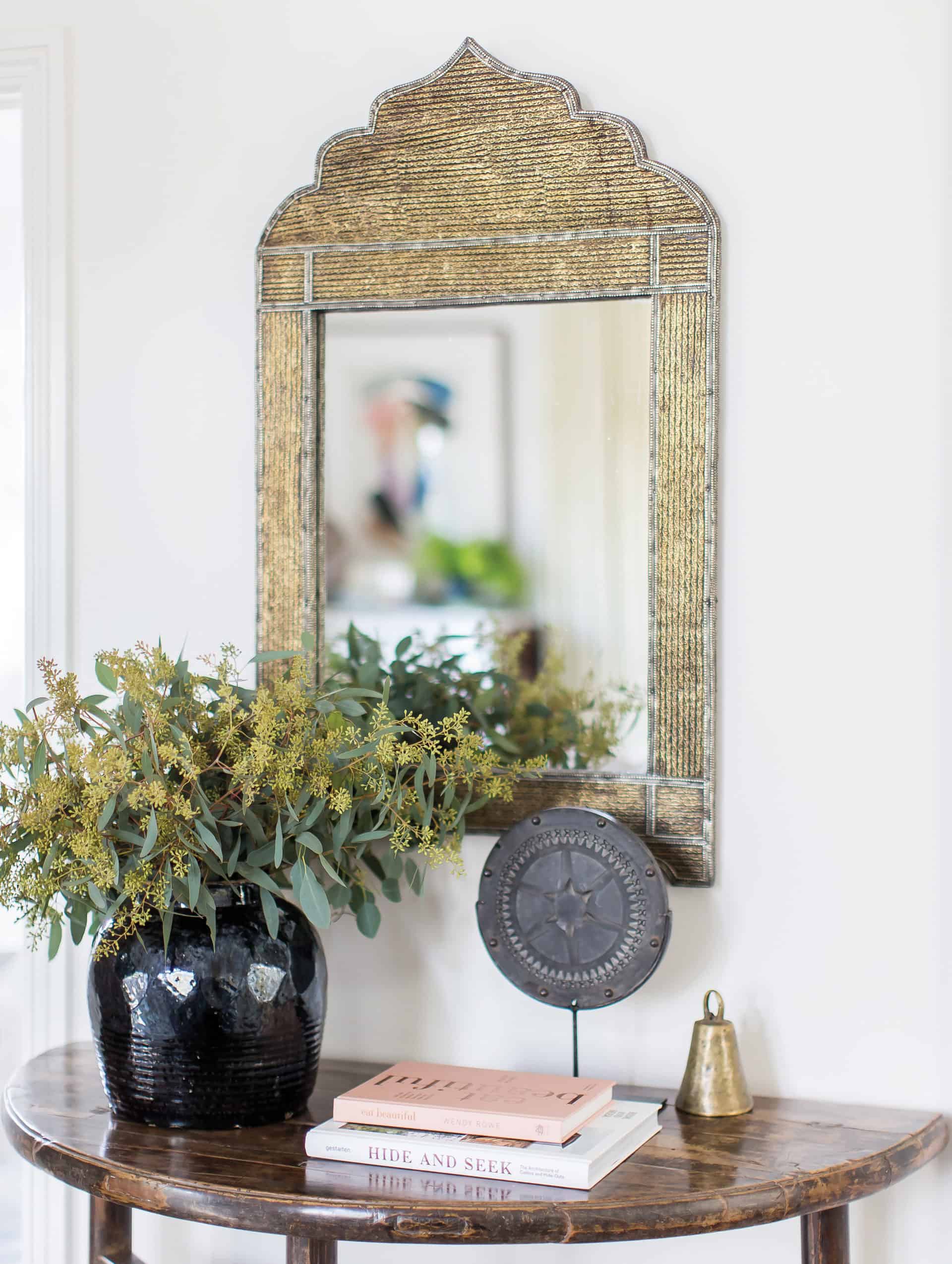
Wendy also incorporated the couple’s collection of artwork and objects. The baker’s rack near the dining nook is an example of a collaborative effort. A lot of the pieces are found objects including vintage pottery pieces Linda collected from a beloved antique store in San Francisco, paintings she had given her husband and books that she loves.
Linda admits she would’ve passed the baker’s rack at the store if it weren’t for WWD. “I love how it works in the space,” she says. As though it’s a metaphor for the home, she adds, “It’s a really simple piece that combines contemporary with some of the more traditional pieces.”